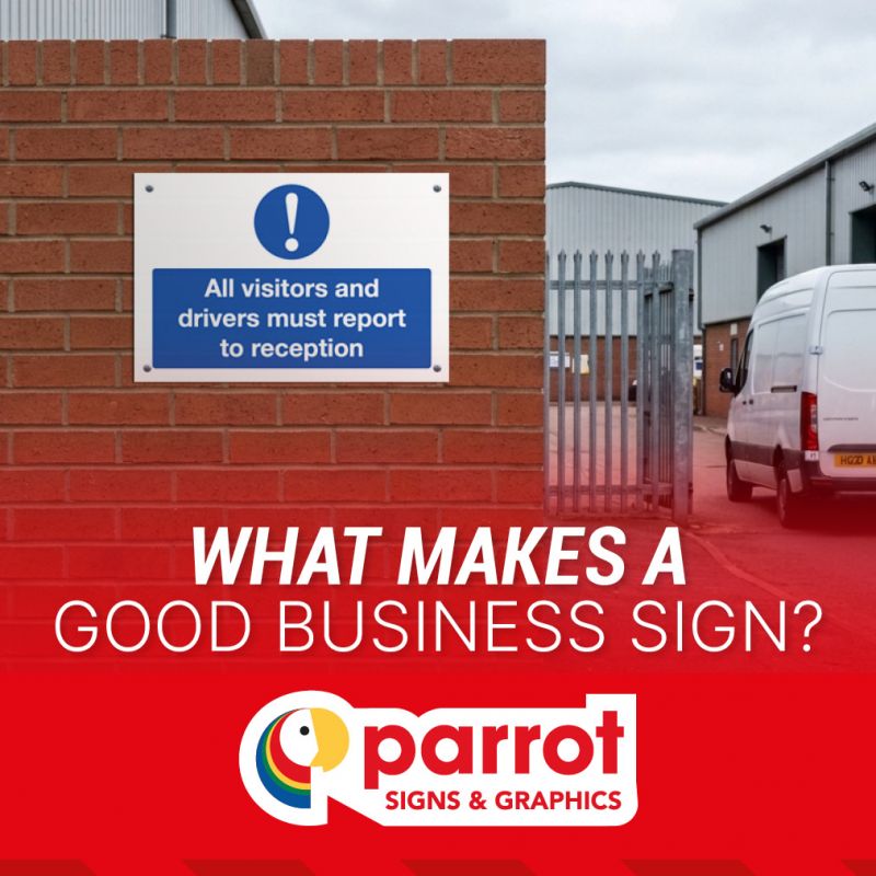
A good business sign does not need to be complicated.
In fact, the most effective signs are often the simplest. They tell people what they need to know, are easy to read and are positioned where the information is actually useful.
Whether it is directing a customer towards reception, identifying Goods In, marking a collection point or providing information to visitors, business signage has an important job to do.
But what makes one sign more effective than another?
There are several things worth considering when choosing signage for your business, from the wording and design through to its size, position and suitability for the environment.
1. A clear message
The starting point for any good sign is the message.
People should be able to understand what the sign is telling them without having to stop and study it.
For example, Reception, Goods In, Customer Collections or Staff Entrance are all straightforward messages. Someone seeing the sign immediately understands what it is communicating.
Longer messages can be appropriate where more information is needed, but it is worth considering whether every word is necessary. A sign is not the place for an essay. The more quickly someone can understand the message, the more useful the sign is likely to be.
2. Wording people will understand
Clear wording is not necessarily about using the fewest possible words. It is about using words that make sense to the people who will actually see the sign.
A business may use particular names for its departments, services or facilities. If visitors are more familiar with one term than another, the sign should reflect that where appropriate.
For example, if customers know an area as the Trade Counter, using that terminology is likely to be more helpful than giving it an internal name that visitors have never heard.
Good signage speaks the language of the people using the premises.
3. Text that is easy to read
Even a perfectly worded message is not much use if nobody can read it easily.
The size of the text needs to be appropriate for where the sign will be used and how far away people are likely to be when they see it.
A small sign on a door may only need to be read from a short distance. A directional sign in a car park or at the entrance to a large site needs to work from much further away.
This is one reason there is no single ideal sign size for every application; the environment and viewing distance both matter.
4. Good contrast
The relationship between the background and the information displayed on it also affects readability.
Strong contrast can make text and symbols easier to identify, particularly where signs need to be noticed quickly or viewed from a distance.
This is one reason signage design is about more than simply choosing attractive colours. The sign needs to remain functional in its intended environment.
5. The right amount of information
It can be tempting to put every relevant piece of information onto one sign.
Sometimes that is useful. Sometimes it creates a sign that nobody wants to read.
Consider the difference between:
"CUSTOMER COLLECTIONS"
and a sign containing a paragraph explaining the complete collection procedure.
There are situations where detailed information is necessary, but where a simple directional or identification sign is all that is required, keeping the message concise can make it much more effective.
If several pieces of information are genuinely needed, they should be organised so that the most important message is immediately obvious.
6. Appropriate use of symbols
Words are not always the only way to communicate information.
Familiar symbols and pictograms can help people understand a message quickly, particularly where the sign needs to be recognised at a glance.Safety signage is the most obvious example, but symbols can also be useful for facilities, directions and other information.
The important thing is that the symbol should be familiar and appropriate for the message it is intended to communicate.
We previously looked at why safety signs use symbols, including the role of standardised pictograms and visual communication.
7. The right sign for the location
A good sign needs to work in the environment where it is going to be used.
A sign inside an office reception has different requirements from one mounted outside a warehouse. A sign on a door has different requirements from one that needs to be seen across a car park.
Consider:
-
Where will the sign be positioned?
-
How far away will people be when they see it?
-
Will it be indoors or outdoors?
-
Will it be exposed to weather?
-
Is it likely to be touched or handled?
-
Does it need to be fixed to a wall, door, post or another surface?
The answers can all influence the most appropriate sign specification.
For a more detailed look at the options available for safety signage, see our guide to choosing the right safety sign materials for your workplace.
8. Position matters
Even a beautifully designed sign will not do its job if nobody sees it.
Think about where someone will be standing when they need the information.
A reception sign needs to be visible from the approach. A directional sign needs to appear before someone has to choose which way to go. A Goods In sign needs to be visible to drivers before they reach the relevant entrance.
This sounds obvious, but it is easy to think about the sign itself without considering the journey of the person who needs to read it.
The best position is usually where the information becomes useful, not simply where there happens to be a suitable wall.
9. Signs should work together
A business rarely needs just one sign.
A visitor might encounter several during a single journey:
Car Park → Reception → Customer Service → Meeting Room
For this to work well, the signs need to form a coherent system.
Using consistent terminology helps. So does keeping the appearance of related signs reasonably consistent.
This does not mean every sign around a business needs to look identical. Safety signs, directional signs, branded signs and information signs may all have different purposes.
But where several signs are helping people navigate the same environment, consistency can make the whole system easier to understand.
10. The information needs to be accurate
One of the easiest things to overlook is whether a sign still says something that is true.
Businesses change. Departments move. Offices are renamed. Entrances are relocated. Customer collection arrangements change. New buildings are added.
A sign that was completely accurate two years ago may now be sending people in the wrong direction. It is therefore worth reviewing business signage when the layout or operation of a premises changes.
This is particularly important for directional signs, visitor information and signs identifying specific departments or facilities.
11. Good signs don't have to be complicated
There is sometimes a temptation to make signage more elaborate because a business wants it to look impressive.
But a sign does not need a complicated design to look professional. For many applications, a clear message, appropriate typography, good contrast and consistent presentation will do the job perfectly well.
The purpose of the sign should always come first. A visitor looking for reception is much more interested in finding reception than admiring the clever design of the sign pointing towards it.
12. Consider branding where it adds value
Business signage can also contribute to the visual identity of a premises.
Entrance signs, reception signs, department identification and customer-facing information can incorporate company branding where appropriate.
This can help create a consistent appearance across the physical environment, particularly for businesses that have established branding used across their website, vehicles, printed materials and other communications.
However, branding should support the purpose of the sign rather than getting in the way of the message.
The sign still needs to be clear first.
13. Know when a standard sign is enough
Not every business sign needs to be bespoke.
There are many situations where a standard sign communicates exactly what is needed.
Goods In, Goods Out, Reception, Staff Only and many other common messages are familiar and straightforward.
Using a standard sign can therefore be the most practical option where it provides the right message, size and specification for the application.
Customisation becomes more useful when the standard options do not quite match what the business needs.
This might be because the wording is different, a particular department needs identifying, company branding needs incorporating or the sign needs to fit a specific location.
14. Don't forget the people using the sign
Perhaps the simplest test of any business sign is to ask:
Who is this sign for?
A sign intended for employees may use different terminology from one aimed at customers.
A sign for delivery drivers may need to be visible from a vehicle.
A sign for visitors may need to assume that the person reading it has never been to the premises before.
Thinking about the intended audience can help businesses avoid designing signs based solely on what makes sense to the people who work there every day.
A good business sign does its job
Ultimately, effective business signage is not about making every sign bigger, brighter or more complicated. It is about making sure the right information reaches the right person at the right point.
A good sign should be clear, readable and appropriate for its location. It should use terminology people understand, provide the information they need and work alongside the other signs around the premises.
Sometimes that means choosing a straightforward standard sign. Sometimes it means creating something more specific.
The important thing is that the finished sign does its job.
Frequently Asked Questions
What makes a business sign effective?
An effective business sign communicates a clear message, is easy to read, uses appropriate wording and is positioned where the intended audience can see it when the information is needed.
How big should a business sign be?
There is no single correct size. The appropriate size depends on the message, viewing distance, location and environment. A sign on an office door will have different requirements from one intended to be read across a car park.
Should business signs include a logo?
They can, particularly where branding is important to the appearance of the premises. However, the logo should not distract from the main message of the sign.
Do business signs need to be customised?
Not necessarily. Standard signs are suitable for many common messages. Custom signage is useful when a business needs specific wording, branding, dimensions or information that is not available as a standard design.
What materials are business signs available in?
The most suitable material depends on where and how the sign will be used. Options can include rigid plastic, aluminium composite, self-adhesive vinyl, Correx and magnetic sheet, depending on the application.
- Check out our guide to choosing the right material for your safety signs.
Choosing effective signage for your business
From a simple reception sign to a complete set of directional and information signs, effective business signage starts with understanding what people need to know and when they need to know it.
Clear wording, appropriate sizing, good visibility and thoughtful positioning can all contribute to making signage more useful.
At Parrot Signs & Graphics, we manufacture safety, information, directional and custom signs for businesses across the UK. With standard designs alongside bespoke options, we can help businesses choose signage that is appropriate for their premises, their customers and the people who use them.